Sunday, December 24, 2006

Contest Ruling Is Finally In - Special Bonus Prizes Revealed

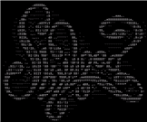
The ruling for the ANSI/ASCII Text Art contest at deviantART is finally in. I blogged about the end of it and my personal favorite about a week ago. Unfortunately did the other judges not agree with me.

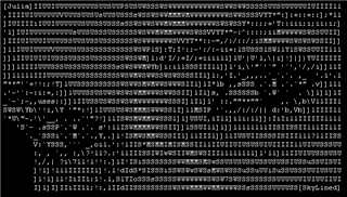
What surprised me a bit was that skylined's entry did not even make the top 5, but it shows how different the opinions of the 6 judges were. Being voted #1 by one judge does not make it a sure win.

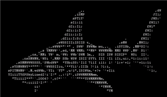
Somebody that was voted #3 or #4 by all judges has a much higher chance of winning.

Here is how the judging works. Every Judge has 15 points to assign, 5 points to the #1, 4 points to the #2, 3 to #3, 2 to #5 and finally 1 point to the #1. This makes 90 points altogether for all 6 judges combined. 5 points does not look like that much anymore, right?

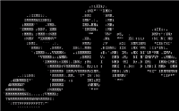
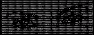
Anyway, all entries can be reviewed here if you want to check them out. The 5 Winners are the following:


Next to the official prizes will every one of the five winners get a one of my "deviantART ASCII" Mouse pads (since all winners were ASCIIs), a small Magnet of my "deviantART ANSI" print and a post card of my ANSI print as well. I hope the winners will like the little extra bonus prizes. Merry Christmas.


Cheers,

Carsten

Wednesday, December 20, 2006

Space Art - Prints and Calendars

Alex Gibson aka Sphereuk is another of my favorite artists at deviantART which I would like to introduce to my blog readers and subscribers.

I did something like this back in April already for the artist with the name Dilekt. I just discovered planet and space art at dA at the time. Space Art now makes up a considerable percentage of art in my dA Favorites and virtually 100% of my dA Wish list.

I think that this is a good Idea, because it extend the reach of these mostly young artists that are still students for the most part. Spheruk, who is from Great Britain, for example just finished his first semester at the university. He studies design (surprise) and wants to become a game designer.

Because of the time he has to dedicate for 3D art and rendering did he say that he has to cut down on the time for creating space art. I hope he will not stop doing it, because his Space and Planet artwork is amazing.

I sent Alex an Email last weekend and requested that he makes a Calendar available at the dA Print Shop with the IMO 12 best of his space art pieces.
He promised to create one and I am looking forward to be able to buy it.

Here are the 12 pieces of space art which I ask Spheruk to use for the calendar which will hopefully become available soon.


In the meantime check out the existing prints by Spheruk at the dA Shop. He gets a cut of the revenue his prints generate. So if you buy a print, you will help Alex out and increase his allowance. You might now that students are poor and are grateful for every extra dollar they can get.

I already bought two other calendars from two other artists which I would like to show you.

Sci-fi Scenery CALANDER
by Swaroop.B.G.Prabhavathi aka Swaroop.
 Reflections Calendar
by Andrea G-Zenith aka Anjicle.


I also bought some more of my own designs. The dA ASCII and ANSI Mouse pads. They are great gifts and make some of my friends happy. It's a great gift, because it is personal and practical.


Enjoy!

Cheers
Carsten aka Roy/SAC

Tuesday, December 19, 2006

The ASCII/ANSI Contest Is Over

Last week did the ASCII and ANSI contest at deviantART end. You can see all contributions to the contest here. I already made my judgements, but a few are still outstanding. That means that no results are available yet.

Yet I still want to present my personal favorite. The artists name is Berend-Jan Wever aka skylined.

His contribution is the 7bit ASCII called "Julia at Awakenings". Here is a small version of the image. It is not original size. Click on the image to get to the deviation which is in original size that you can clearly see that it is made out of regular characters which you can find on your keyboard.


I like the style. I like the ASCII logo of his name actually even better. Especially this one. .


Yep, it's a shark. I think that the Idea alone is already astonishing, let alone the realization by using simple text characters.


The following two logos look like "Disco" style.. without the bright colors hehe. I don't like them as much, but they are somewhat cool anyway.

This one seems to be the predecessor of the contest entry. The Idea is already visible, but the realization is much simpler than for "Julia at Awakenings".


Well, I am looking forward to hear the ruling. More to that later this week.